Supporting a Growing Brand System for Coastal Sun
OBJECTIVE
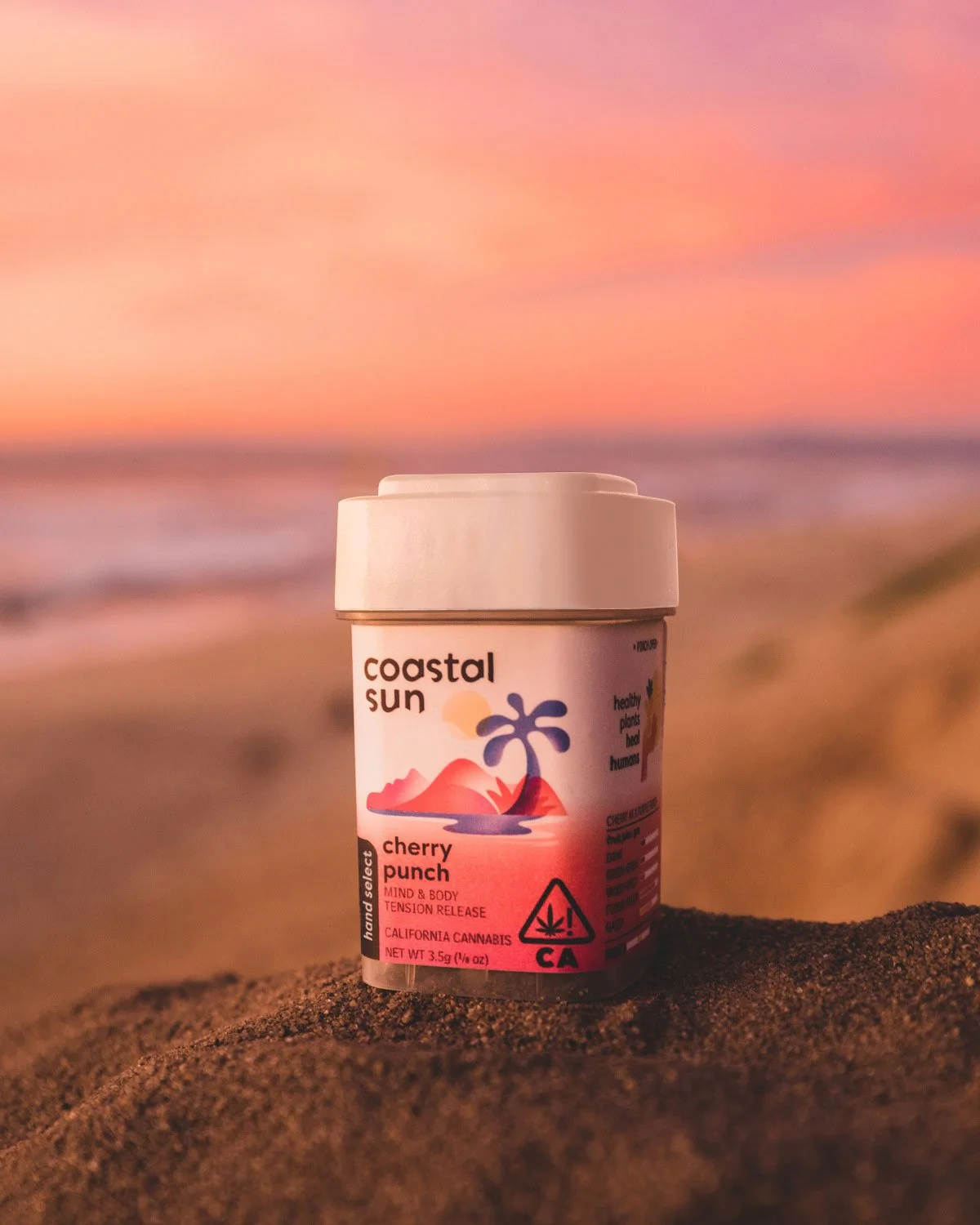
Support an established brand by extending and operationalizing its visual system across a growing product line. The goal was to maintain brand consistency while introducing enough flexibility to accommodate new SKUs, marketing needs, and internal workflows.
Coastal Sun already had a strong visual identity. My role focused on making that identity usable at scale, across packaging, marketing, and documentation.
SERVICES
Packaging & production design
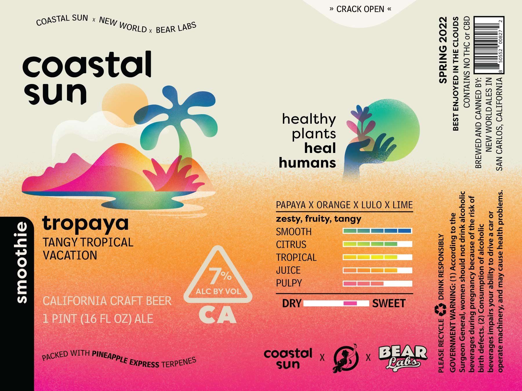
Color system development
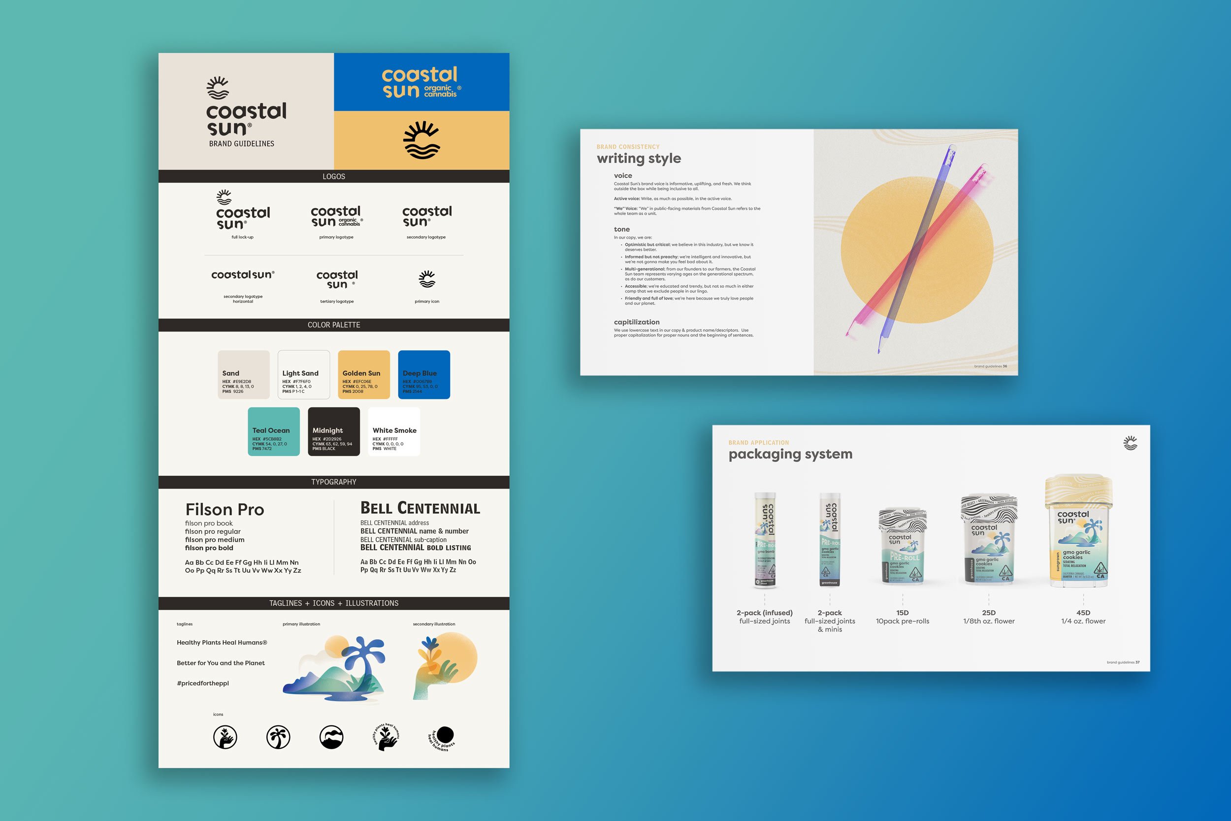
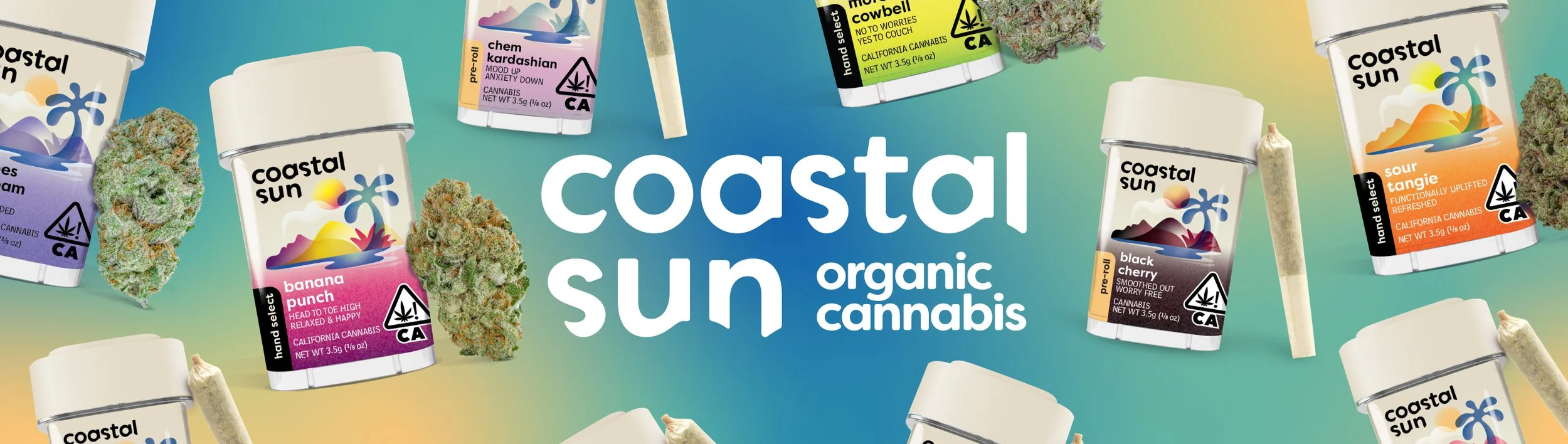
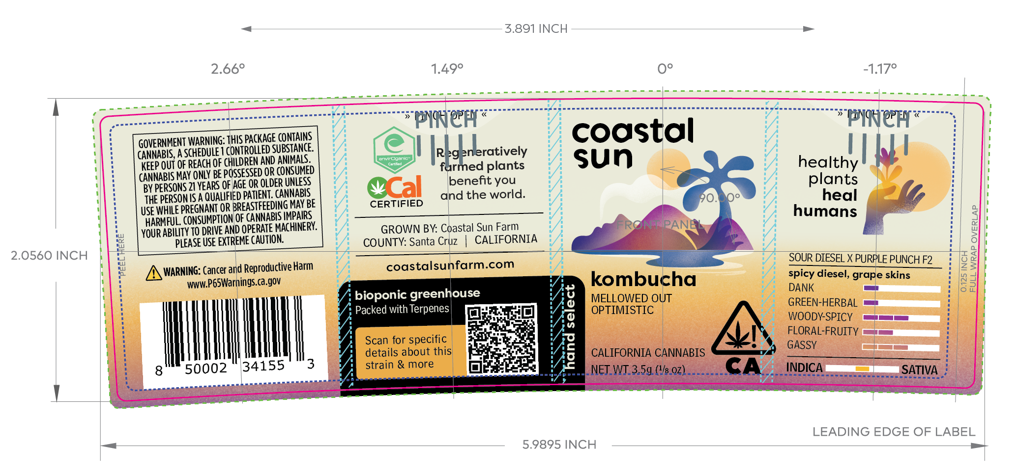
Label updates and SKU expansion
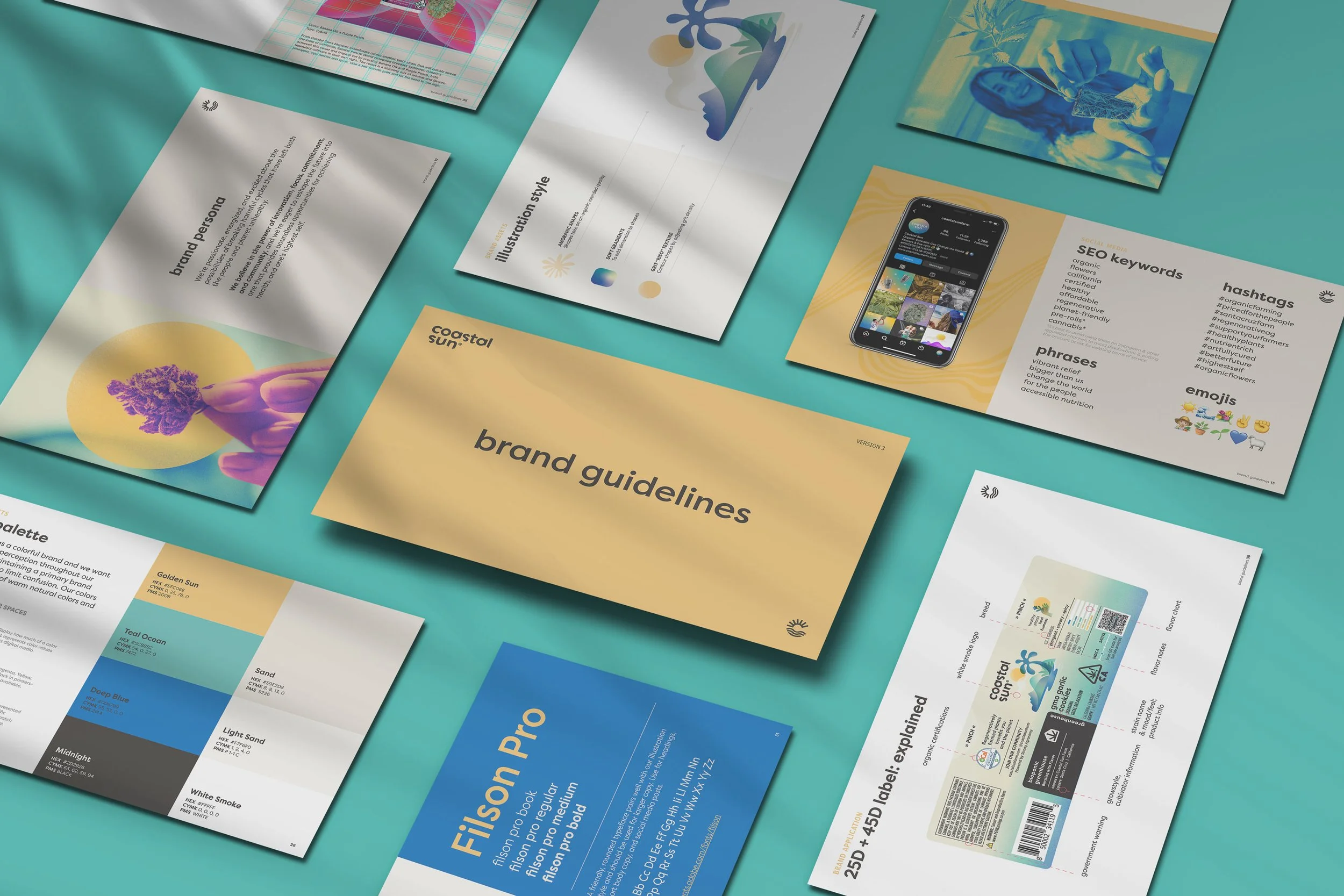
Brand guidelines creation
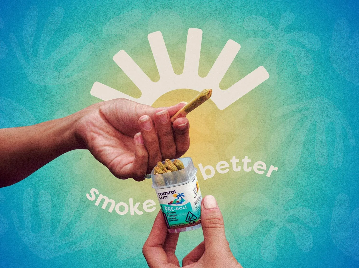
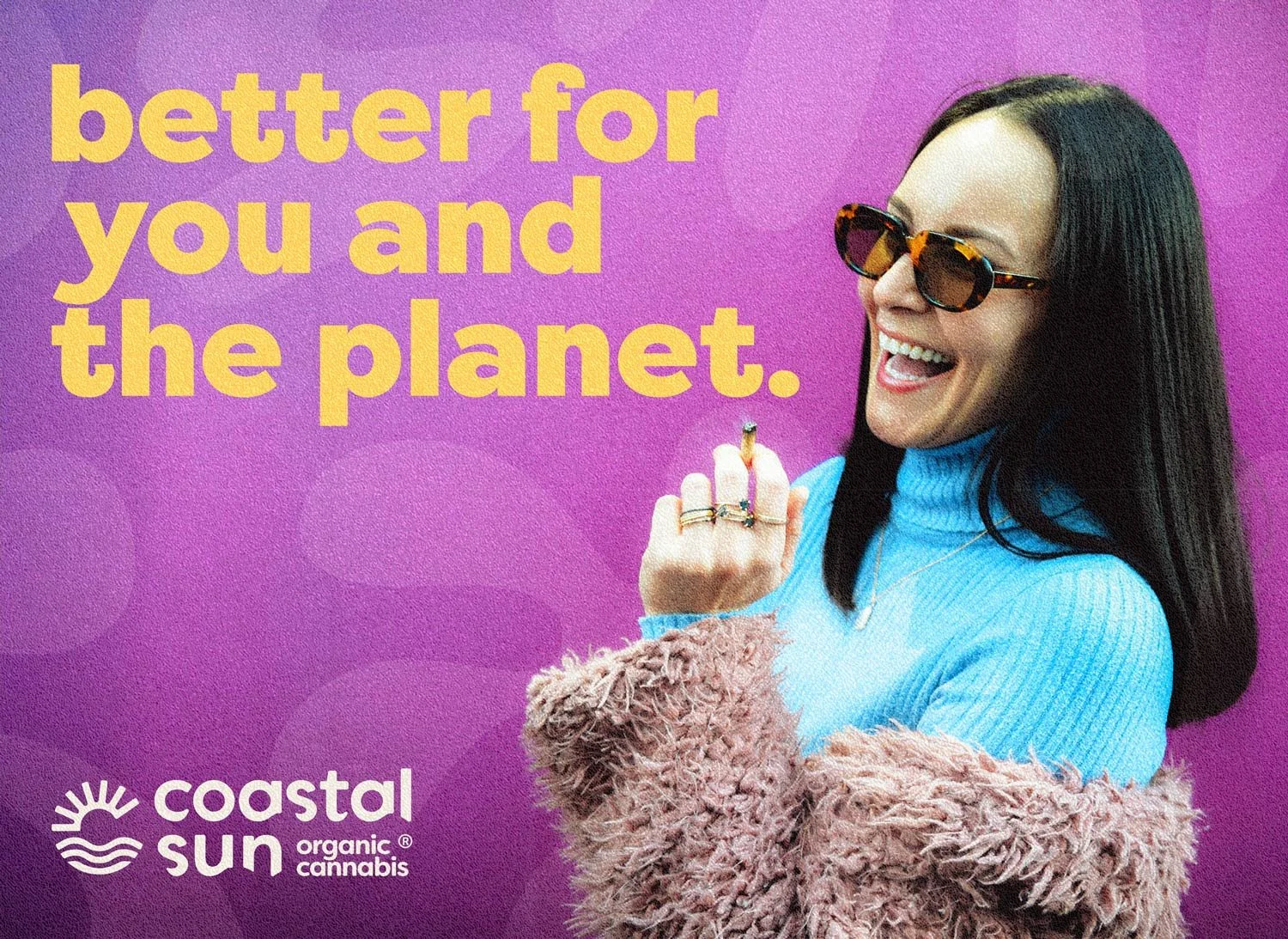
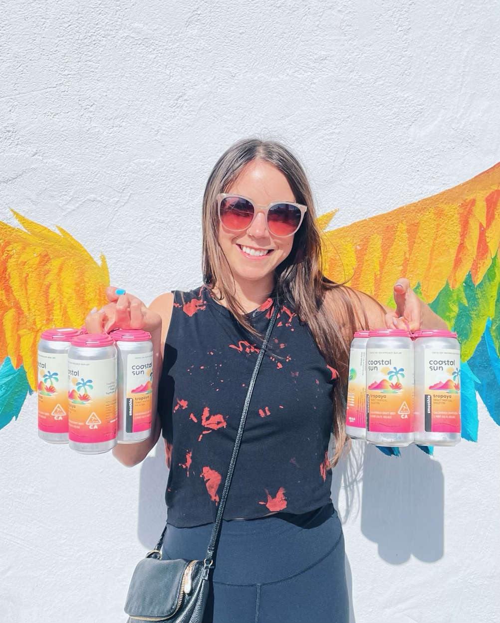
Digital marketing assets & product renders

The Process
Rather than redesigning the brand, my work centered on extending the existing system in a thoughtful and consistent way.
One of the main challenges was color. The brand’s core palette included only a few primary colors, but the product line required many distinct SKUs. I developed complementary color extensions that stayed true to the brand while allowing each product to feel clearly differentiated on shelf and in digital contexts.
From there, I applied the updated label designs across production-ready files and dielines, ensuring accuracy and consistency for print. In parallel, I created digital product renders and marketing assets that mirrored the physical packaging, allowing the brand to present a cohesive experience across web, social, and retail environments.
The Challenge
As the brand and team grew, it became clear that internal stakeholders needed clearer direction on how to use the visual system correctly.
To address this, I created a comprehensive brand guidelines document that outlined logo usage, color application, typography, iconography, and packaging standards. The guidelines were designed to be practical and accessible, helping internal teams and partners maintain consistency without needing ongoing design support for every update.
The Outcome
The final system made it easier for Coastal Sun to introduce new products without losing consistency across packaging and marketing.
Labels, digital assets, and internal documentation worked together in a way that supported day-to-day production and future growth.
For me, this project was about stewardship: respecting an established identity while extending it in practical ways that support production, collaboration, and long-term use.